Daisy
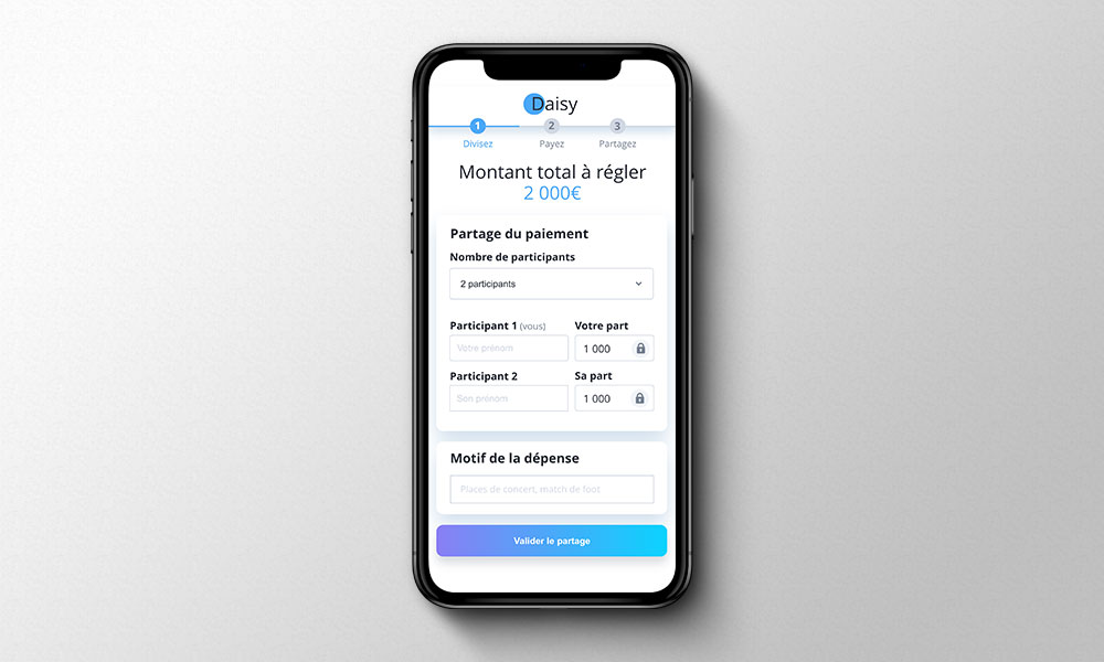
Sharing the shopping cart of airline tickets or concert tickets has always been complicated? Daisy is a SaaS solution that has been created to help people share the bill for online purchases and is implemented directly in the partner’s shopping cart. The buyer only pays his share and sends a link to the co-payers so that they pay their share in turn. For the customer, this solution allows him to avoid advancing sometimes high fees and everyone can stand side by side at the concert or on the plane.
Company
Le Pot Commun
Year
2018
Type
SaaS Solution
Skills
UX Research
Design Sprint facilitator
Product Design
Context
As part of the evolution of Le Pot Commun, we were challenged on the creation of a new product. Refund applications between friends become competitors because instead of creating a money pool, the participants in the gift reimburse the buyer directly. So we had to bypass this refunding step.
Problematic
How can a client avoid having to advance the fees of all co-payers?
Team & role
Being Design Team Leader in the startup Le Pot Commun, I proposed that we do a Design Sprint to stimulate creativity and exploit the best ideas and test the viability of the product.
So I had a role as a facilitator for this project and I led the Design Sprint over a week, which allowed us to have our prototypes tested. I coordinated the team to guide them through the different stages of the sprint, where we were able to redefine who our users are, create user flows, model on paper, exchange our ideas, discuss them, prototype, and finally test.
Design process
In order to determine whether this product was worth developing, we began by interviewing target users. After reviewing all their feature requests, we were able to identify their main problems: they wanted an easier way to buy in small groups of friends, without having to advance the cost for everyone.
Although the product will evolve over time, we focused on creating an MVP that meets the user’s essential needs.
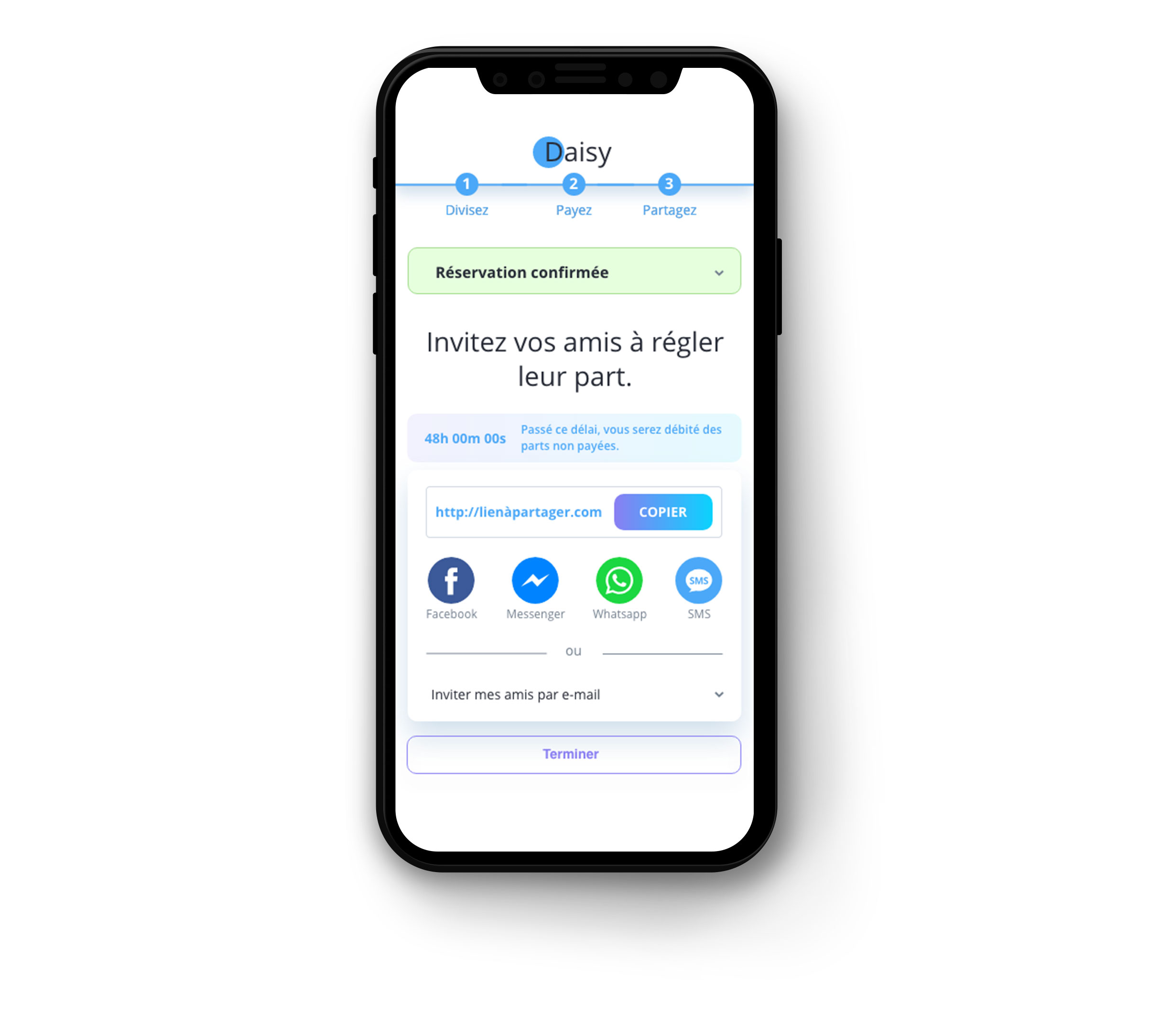
We identified the key points that needed to be included in the product to build the MVP, and then we created the user flows accordingly. At this point in the process, we realized that not everyone knew their friends’ email addresses, so we needed to offer sharing via messenger, whatsapp, etc. as a means of communication.
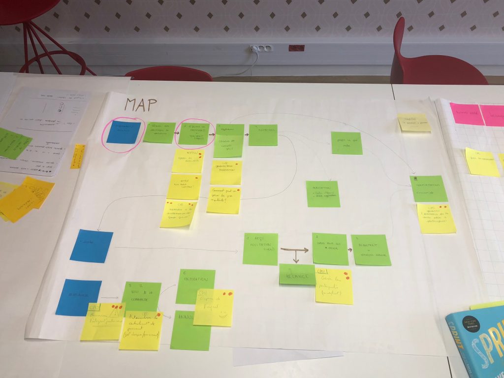
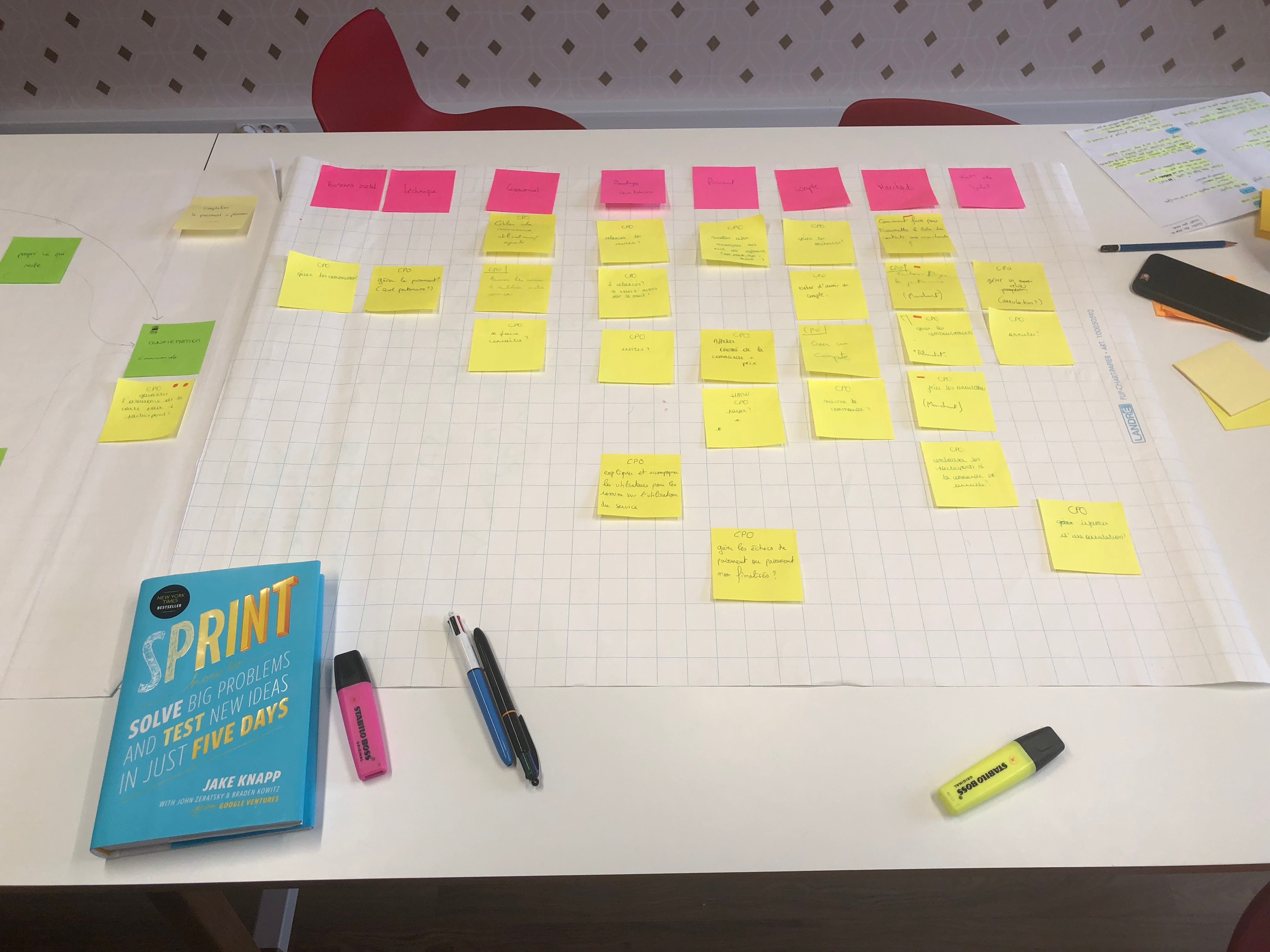
Based on user flows, we tried to bring out all the possible actions by the users by answering the question “How can we […]?” Then we sorted them with an open map sort, in order to organize them, and then prioritize them, in order to define what the main actions of our MVP will be.
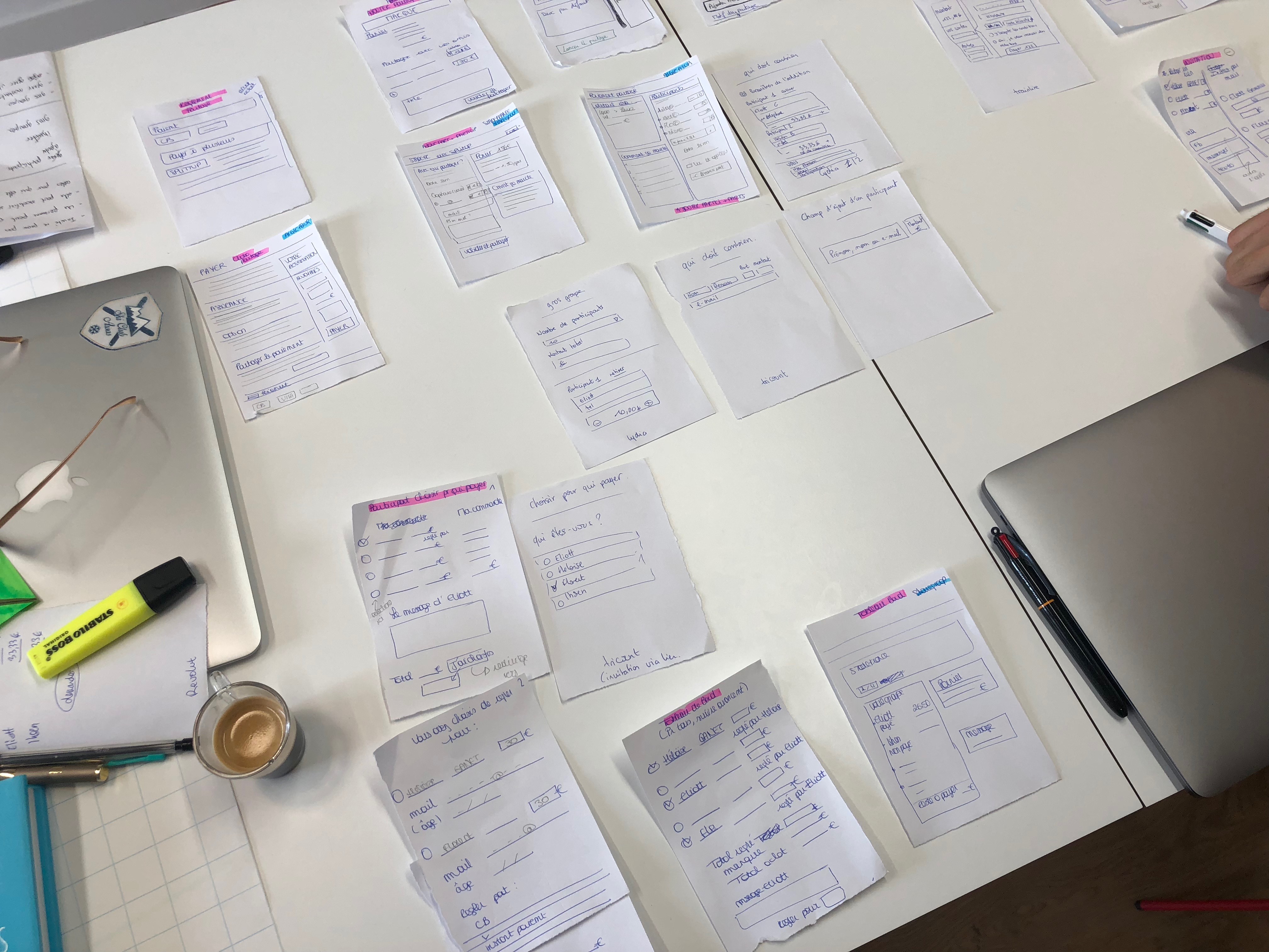
We had all the elements in hand to start the paper models. After looking for good ideas on the internet that we could use, I asked everyone to shut down their computers and phones, to concentrate on the paper mock-ups. White sheets of paper on the table, pencils in hand, we started to create our different screens. We then recreated the users flow with our screens, and we discussed what we had just created, and voted for the best ideas. We were ready for prototyping.
User tests
After preparing the scenarios and prototypes, I prepared the interviews, recruited 5 users, and tested the interface. Several problems were revealed:
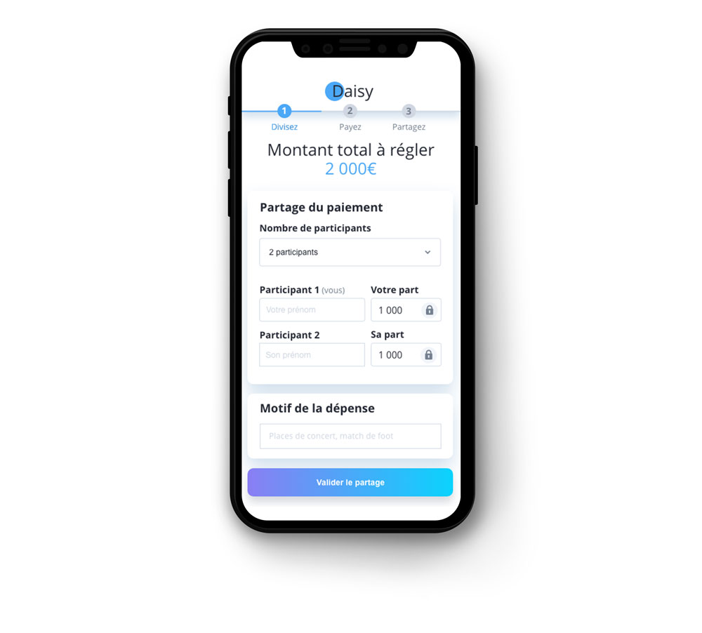
– not separating the first block “you” from “your friends” in the understanding of how to share the total amount.
– To have only one field “identity” and not two fields, “first name” and “last name”. They would only use this service between friends, or colleagues, so no need to add a dedicated field for the name.
– The “reason for expenditure” field was too long, a short sentence was enough.
This made the form difficult to understand and seemed long and complicated, whereas the goal was to facilitate the sharing of the payment.

User Interface Design
The goal of the interface was to keep the product fun and modern. This was accomplished through the use of rounded corners, vibrant gradients, and shadows.
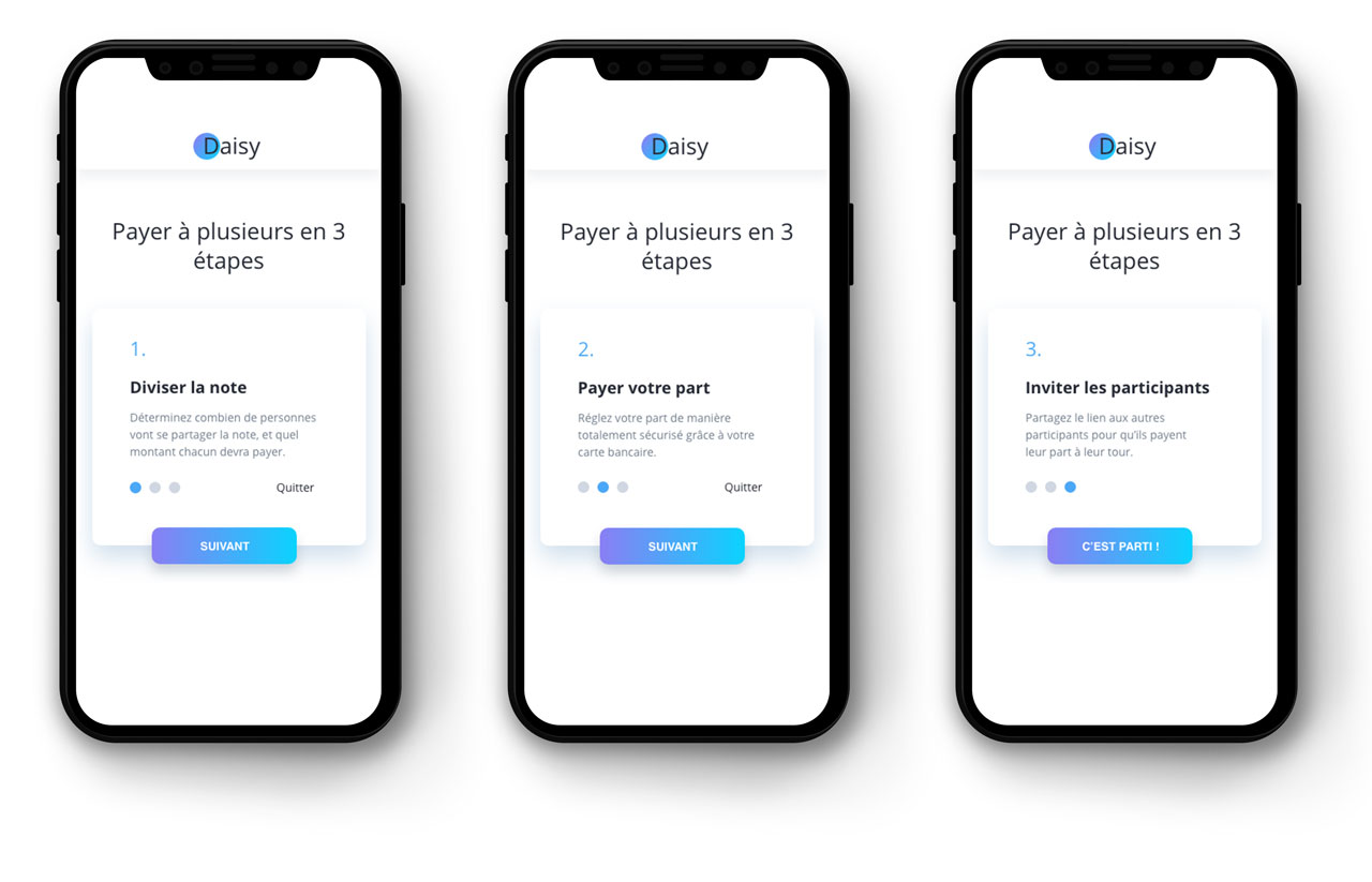
Billing division
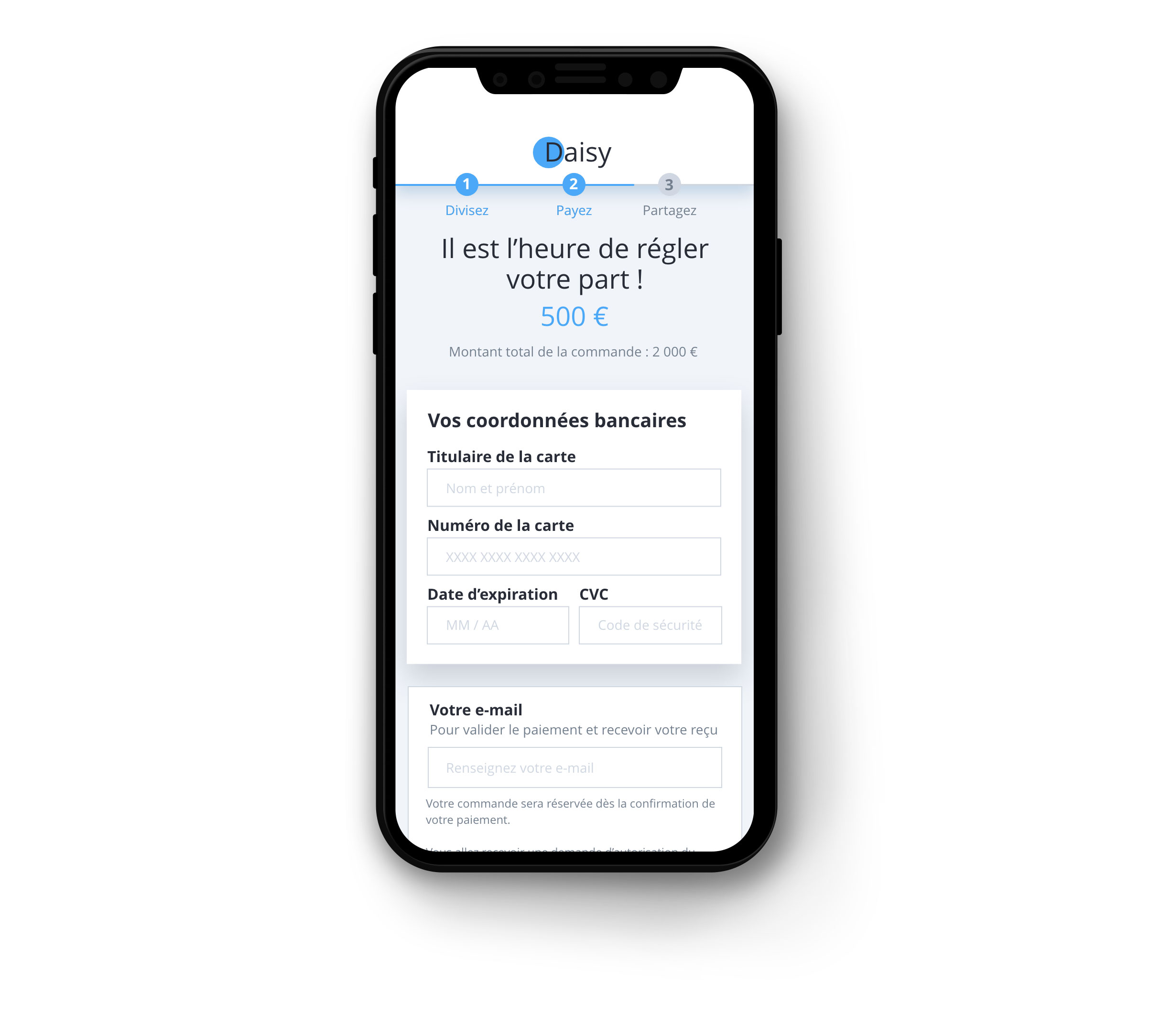
Payment of his share
Invitation to come and pay his share
Screen as a guest

